(Dulux)
Vivid greens, hot magenta and sizzling reds... After a bold & loud summer of ‘barbie-core’ aesthetics dominating the colour market this year, 2024 finds us ready to soothe these fiery trends, turning to more gentle and sophisticated doses of colour in the form of dusty neutrals and pastel tones.
In preparation for the new year, Sweet Embrace has been named Dulux’s Colour of the Year for 2024, strengthening the desire for calming, natural colours within the home. We’ll show you how you can adopt this trend in your next project, using the colour as a foundation along with our ranges of compatible tiles to create a style that will work for you.
Where do colour trends come from?
Trend development is influenced by everything around us in society: colour reflects what we desire, yet also what we need from our surroundings.
Over the last few years, nature-inspired colours have dominated our trends; sea blues, moss greens, and mineral greys to name a few. And while natural colours will always resonate with us as humans, the yearning for these trends reached new heights during the global pandemic; a time when we were forced to distance ourselves from the outside environment. The desire to bring the outdoors into our spaces and connect us with nature continues to be un-matched and stands tall as a trend that won’t be going anywhere soon.
Moving into 2024 and beyond, we’re seeking positivity and joy from our surroundings, as an antidote to the uncertainty happening around us. A combination of our busy schedules paired with fragile times of political unrest, environmental movements and the increasing cost of living leave us longing for happy, welcoming and supporting colours. It’s more important than ever to create our own special places of sanctuary and clarity within our homes.
How can the Colour of the Year work for me?
Dulux describes Sweet Embrace as a delicate, soft, neutral tone. It’s a versatile, inclusive colour which can act as a backdrop for many styles, making it an ideal choice for incorporating tiles. It’s all about making your home about you, centring a palette around your personality and identifying what you want from a space.
Using the Sweet Embrace colour stories, we’ve pulled together some of our favourite Stone Superstore tiles to complement the upcoming trend:
The Warm Colour Story
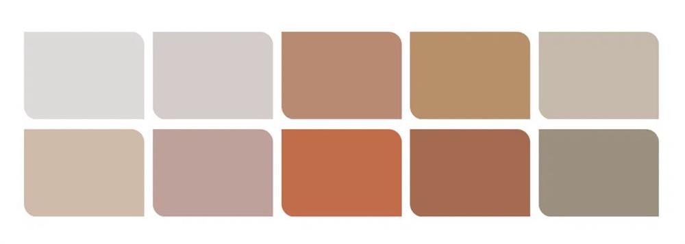
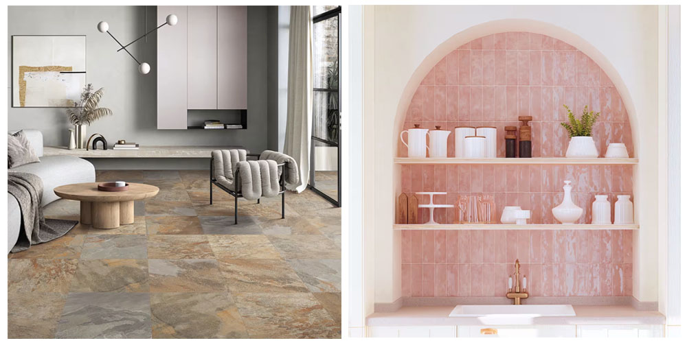
For a cosy and comforting look, opt for earthy oranges, browns and terracotta to complement the warm undertones of the shade. Organic surfaces and finishes work well here, with natural stone, glazed metro tiles and more rustic effects giving a down-to-earth look. This is a colour story centred around creating a warm, friendly space that is all about you, making it ideal for gathering areas such as kitchens, dining or living spaces. It will complement a mix of vintage or modern tastes, but don’t be afraid to mix the two for a quirky, eclectic style.
.jpg)
- Slate Natural Stone Effect Porcelain Tiles
- Soriano Bianco Patterned Hexagon Tiles
- Artisan Cotto Metro Tiles
- Valentina Blush Metro Tiles
- Winchester Almond Metro Tiles
- Salcombe Rose Crackle Metro Tiles
- Venetian Cloud Grey Metro Tiles
The Calm Colour Story
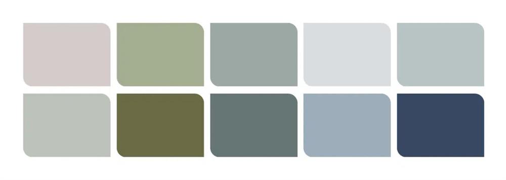
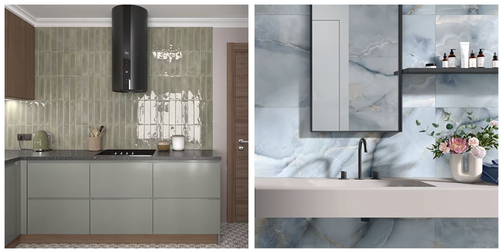
If you're seeking sanctuary, look for cool aqua blues & muted greens for a tranquil feel in your space. Elements of pattern & fluid marble-effect tiles work well here to add a dynamic contrast to the more subtle palette. Sweet Embrace can be used here to balance the cooler colours, offering a touch of warmth with a soft floral accent. Ideal for use in smaller kitchens or bathrooms, these natural colours can help to make spaces feel bigger than they are, encouraging us to relax, unwind and think clearly.
.jpg)
- Onyx Blue Polished Porcelain Tiles
- Babylon Olive Metro Tiles
- Nautilus Navy Metro Tiles
- Moroccan Sage Patterned Tiles
- Venetian Hunter Green Metro Tiles
- Windsor Light Blue Metro Tiles
- Valencia Azure Metro Tiles
The Uplifting Colour Story
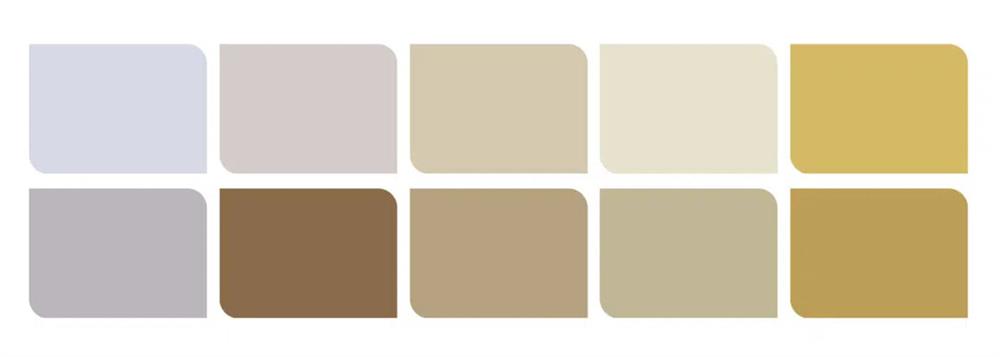
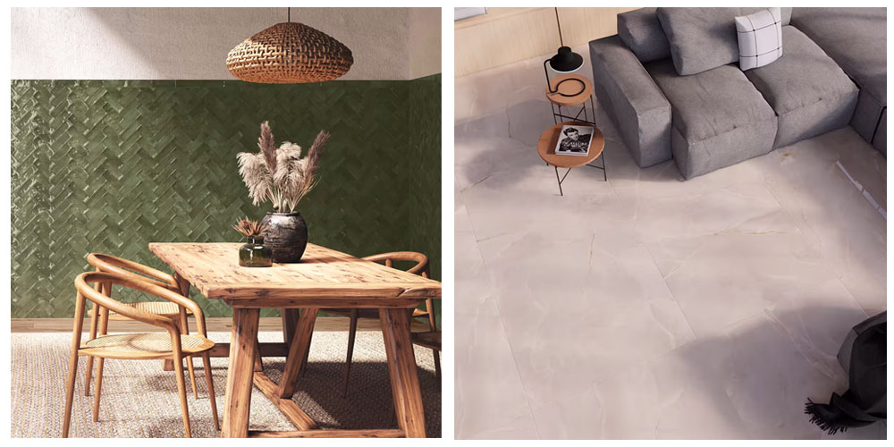
For more of a joyful, optimistic style, consider using sunny yellows, sugary pastels and cosy, inviting beiges. While Sweet Embrace promotes a more delicate, soft tone, that doesn’t mean you should shy away from using brighter, bolder colour or playful, patterned tiles to complement it. A darker accent of an earthy brown, or even natural wood-effect tiles will also work well here, helping to ground the more ‘out-there’ palette. Consider using this palette in areas where you want to create a sense of energy, warmth and positivity such as kitchens or hallway entrances.
.jpg)
- Deckwood Taupe Ceramic Tiles
- Cavendish Mustard Metro Tiles
- Geo Blush Hexagon Tiles
- Marlborough Ivory Metro Tiles
- Wentworth Cross Patterned Tiles
- Onyx Reale Polished Porcelain Tiles
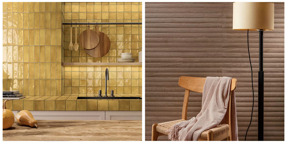
At Stone Superstore, our range of tiles are selected with you and your home in mind. While colour trends may seem daunting to bring into your projects, remember a fresh lick of paint or new accessories can be a great and easy way to bring an entirely new look to a space. We strive to offer versatile products that can work with any colour, for a home that you love and will stand the test of time.
Visit our blog to discover our further ranges of coloured, patterned & natural tiles – including our top tips for choosing the right colour for your floor tiles – or explore our full range of tile advice guides.
Share post

